Published August 22, 2017
Tags:
I still remember that first day of Typography 101: Create a desk card with your name on it. There were no restrictions other than to make it look attractive and include all of the text provided (which, of course, was far from extensive). Easy enough. On that day, we fledgling InDesign aficionados tossed all of the given ingredients into the pot and proudly printed our creations–which, as you can imagine, varied wildly. And naturally, with limited ideas of what our creativity could produce and little knowledge of the software itself, every student took his or her creative liberties in the one aspect we all knew how to influence: the fonts.
Fonts serve a myriad of functions in the design world; they draw attention, they create visual interest, and they carry with them an attitude–a kind of visual flavor that teases the eye’s palate into believing that those words mean something more. However, as with all good things, there is a such thing as too much contrast on the page. There is certainly such a thing as too much flavor. At the end of the day, a fine bottle of wine makes an excellent nightcap– but if you get drunk and forget, you may as well have been drinking cheap beer.
So, back to the fonts. We’ve all seen the signs hanging in Mom & Pop Restaurant windows denoting the variety of milkshake flavors available, every delicious concoction displayed proudly in its own font face–and all the while, your eyes subconsciously settle somewhere in that giant block of contrasting fonts thinking, ‘where do I look first?’ This is the crux of the problem: A talented designer doesn’t toss the reader in a pot to let them fish for the first solution available. Instead, a talented designer subtly leads the reader through the maze of text, stopping only where they wish the reader to stop. In recognizing the decorative nature that fonts bring to the table, you can also acknowledge that they play a large part in creating contrast on the page. Good typographic structure uses emphasis sparingly. After all, your goal as a designer at its core is to make information easier for the reader to digest–not to make sure that every phrase wears its own pretty dress.
Please, for the sake of legibility and for the sake of our collective sanity: Limit your use of fonts. 2-4 faces on a page is more than enough in almost every situation. Most design projects will call for a body font, a display font, and maybe an additional accent or two (and when I say maybe, I mean probably not). Think of it this way: When you show up to a typical wedding, the bride is wearing an elegant, regal dress with a flowing train and lots of frills to accent it. The bridesmaids are wearing clean cut and elegant dresses that complement the bride’s but don’t match it in accents. Then, everybody else just shows up in a clean formal outfit. If a guest dresses more extravagantly than the bride, they stand out like a sore thumb. And probably get beat up by the bridesmaids later.
Once you’ve established a well-paired (and limited) font set, stick to your guns. Those same fonts should be repeated across the page(s) to tie it all together unless you’re intentionally drawing emphasis to make it stand out from the crowd. It’s not a bad idea to invite someone to look over your design just to point out the things that catch their eye so that you can mitigate how much of the page or publication pops. There are instances where you want to switch up your font sets to break up your overall publication. In this way, contrast is good–in example, most magazines will settle on a different font set for each story to ensure that they all have a unique style. However, this only makes sense because each individual article is not related. A 400 page book is going to keep one style throughout because the entire publication stands as a whole. Let’s consider the below example:
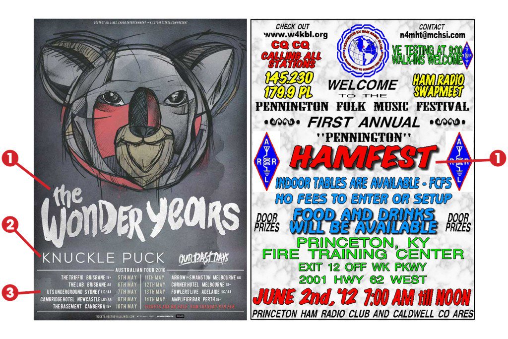
An example of good contrast vs. too much contrast.
On the left, we have a showcard from a band I may or may not be partial to. Just a quick glance at the poster shows you an interesting graphical element before your eye is drawn to a dominant header (in this case, the band name), a supporting subhead (in this case, the supporting artists), and the rest falls into body font. If your audience isn’t interested by the time they’ve read the header and subhead, they won’t continue on to the main information– and that’s ok. If they are, you’ve already got their attention. On the right, we have the First Annual Pennington Hamfest. They did an ok job of showcasing the event title, but after that the entire page is a wash (if you made this, sorry). I frankly don’t know what this event is about because I didn’t read the poster–an unfortunate side effect of bad design. There are, of course, other issues with this design that hold it back, but let's stay focused on the topic at hand.
Just remember, too much contrast just becomes noise (or in industry lingo, your page weight becomes too heavy). In order for something to stand out, there has to be a norm or standard to stand out from. Rules are meant to be broken–but make sure when you do so you do it with purpose. Not only will your readers thank you, but your editors will thank you too. After all, fonts aren’t always cheap–and they certainly aren’t all free.
Copyright © 2021, Tru North Design Co, LLC. All Rights Reserved.